Category Archives: English

Tower of Prince Henry, Reversed

Ok, for you to enjoy this blog post I’m pretty confident that you have to be a bit of a JavaScript, Python and map geek. At least you will have to watch this presentation from FOSS4G 2014 by Eric Theise.

Ok, you watched it? You got his point? My takeaway was that as you generate map tiles further down in the zoom stack you’ll have to generate a ton of tiles, but in many cases you only want to show a map that puts your town/buisiness/whatever on the map. But, you would like some context, and then you have to set the bbox in TileMill WIDE. And then the tileset gets large, and you don’t bother.

So, I thought that there should be a way to limit a web map library to only request tiles that are within a given bounding box. Turns out that Leaflet has this option, set the “bounds” parameter on an L.TileLayer and you are good to go?


L.TileLayer('http://{s}.tile.osm.org/{z}/{x}/{y}.png', {
attribution: '© OpenStreetMap contributors',
bounds: bounds
}).addTo(map);

Well, the user can still pan away from the area, so set “maxBounds” on the map as well:

var map = L.map('map', {maxBounds: bounds}).setView([63.4, 10.3], 0);

This works, the amount of requests sent to the tile server is reduced, but it doesn’t look good, does it:
tilelayer

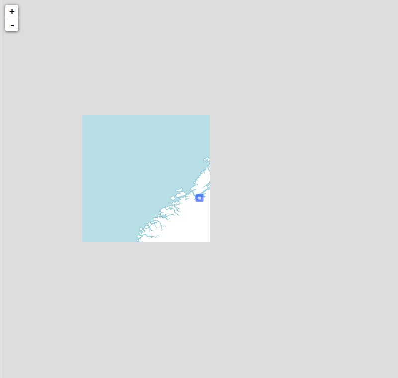
The main problem is that L.TileLayer only loads tiles that intersects with the bounding box you’ve set (the small, blue square on my map). So, we’ll have to do something about that, and after a bit of digging I found that the “_tileShouldBeLoaded” method of L.TileLayer performs this check (at least in version 0.7.3). Thankfully, Leaflet classes are easy to subclass, and so “L.BoundedTileLayer” was born.

To get more context around I wanted to show some neighboring tiles as well as those that intersects the bounds. So, after we check for intersection we perform one additional check, which I think is best described in code:


//the distance from the tilecenter lng to closest bounds edge
var lngDist = Math.min(
Math.abs(tileCenter.lng - options.bounds.getEast()),
Math.abs(tileCenter.lng - options.bounds.getWest())
);

//the distance from the tilecenter lat to closest bounds edge
var latDist = Math.min(
Math.abs(tileCenter.lat - options.bounds.getSouth()),
Math.abs(tileCenter.lat - options.bounds.getNorth())
);

//these are probably equal
var tileWidth = Math.abs(nw.lng - se.lng);
var tileHeight = Math.abs(nw.lat - se.lat);

//check if tile should be loaded
return lngDist < tileWidth && latDist < tileHeight;

In essence, I check if the distance from the distance from the center of a given tile is smaller than the width or height of a tile. This can probably be optimized a bit, and I can almost guarantee that there are corner cases that I've missed, but it seems to work as expected:

boundedTileLayer

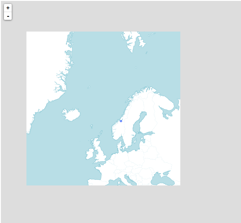
Now we get more context, and we still limit the amount of tiles requested. Happy?

No: we still have to generate all those tiles, because we can't know what tiles the client will request. So, ditching JavaScript and Leaflet for a bit I switched to Python and tried to find a way to generate a list of all tiles the client would request using L.BoundedTileLayer for a given bounding box.

Luckily some smart people have already tackled the maths involved in computing tile indexes from bounding boxes, and the open source script I found at http://www.maptiler.org/google-maps-coordinates-tile-bounds-projection/ was a good starting point. After that it was just a matter of porting the logic from L.BoundedTileLayer to Python, free myself from the Leaflet context and write some 30 lines of code (3-4 hours of trial and error, I don't know how many times I've mixed up axis ordering!).

In the end I could throw a bounding box and a minimum and maximum zoom level at my script and get back a list in the form of:


[
{"z": 0, "y": 0, "x": 0},
{"z": 1, "y": 0, "x": 0},
{"z": 1, "y": 1, "x": 0},
...
]

But this doesn't help me much, I want to generate these specific tiles using TileMill! So, then I started researching how to do that. Nothing came up, except this page describing how to export tiles from TileMill via the command line. I studied the (lack of?) documentation, before I started digging into the source of TileMill and TileLive (which TileMill uses to use Mapnik to render tiles), but after 3 hours I was going nowhere, and it did not work. The next day I asked on stackexchange, and a couple of hours later it dawned on me (to quote my own answer): "that the option --list=[file] could be what I was after."

After digging a bit through the tilemill and tilelive source code i found that this options is (not suprisingly) used by the filescheme renderer (it says that in the comments), and some further digging in the source code to figure out the format of the file, I was able to tell TileMill to render a specific set of tiles.

Success!

Well, a bit on streamlining was called for, so I cleaned up stuff a bit, created a config file for input and looked into calling the TileMill export function from my Python code. This all worked fine, and pretty soon I could type "python tile.py -c config.json" and 3 minutes after have an .mbtiles file of about 14 MB that covers the Trondheim municipality, zoomable from zoom level 0 through 18. Neat!

Then, the moment of truth. Would the tileset I generated line up with what my Leaflet layer requested? I installed TileStache, and 30 seconds later I had a tileserver running at localhost, serving my generated .mbtiles file to my Leaflet map! And it worked!

So, why should you care? Well, I for one, think this is cool by itself, but I also see some useful applications for this. The components I've built now are not far away from the point where I can invoke the generation of a new tileset from a web map. If I do this i can load up a PostGIS database with up-to-data, detailed map data (and refill it through a cron-job or somethin), define the cartography in CartoCSS, and generate a small tilecache for small projects on-the-fly, when needed.

The only drawback is that I have to learn CartoCSS properly to do this, but I guess that's the topic of another blog post.

Do you have any ideas how this can be used, improved or built upon? Feel free to let me know, either in the comments here or via a pull request to the GitHub repo!

Debunking Map Myth #4: The earth is round

Ok, ok, unless you are a member of the “Flat Earth Society” (or a geographer), you might think I’ve gone insane right now?

Well, the earth isn’t round if you by round mean a “sphere“, which Wikipedia defines as:

[…] a perfectly round geometrical and circular object in three-dimensional space that resembles the shape of a completely round ball

So, what is the earth then? Actually, the Earth is a misshapen blob of matter that if matched to a mathematically defined shape would be an “ellipsoid“, i.e. the three-dimensional variant of an ellipse, or a lightly squeezed sphere if you like.

So, dependent of how mathematical you need to be the earth is either an ellipsoid, and these ellipsoids can be defined in several ways, as we discussed when debunking myth #1. These ellipsoids are defined by the parameters semi-major axis, a and semi-minor axis, b, from which you can deduce the flattening, f. The flattening occurs due to the fact that the earth spins.

This ellipsoid is what the GPS-systems use to determine your position, and forms the basis of latitude/longitudes.

But, the more interesting case is perhaps the “misshapen blob of matter”, called the Geoid, that is:

[…]the shape that the surface of the oceans would take under the influence of Earth’s gravitation and rotation alone, in the absence of other influences such as winds and tides.

To determine the actual shape of the geoid, geodesists rely on gravitational measurements from satellites, and by knowing the actual geoid height at a known location you can get a rather accurate idea of your “height above sea level” from a GPS (which really only measures the “ellipsoid height”. These calculations are rather complex, but given decent data they are simple enough that I’ve managed to write a Fortran program which does compute it.

So, there you have it, the earth isn’t round: it’s either ellipsoidal or misshapen, dependent on what you intend to use it for (and for the purpose of myth #5, it’s certainly not ellipsoidal!)

(And by the way, people in the middle ages did not think the earth was flat either!)

Foss4g 2014: The good, the bad and the beers

After the closing-party last night I am in a post-foss4g-mood. That is, I’m hung over and over-stimulated at the same time. So this should be a perfect time to reflect on the conference. TLDR: It was great, going to foss4g feels like coming home!

So, we (that is, Alexander and me) arrived in Portland by plane from Norway last saturday, and found our “condo” rented through AirBnB. Note to self: rent a place, skip the hotels, much better! The first days we spent drinking beers, shopping and enjoying the city. Tuesday was JsGeo-day: that is a whole day filled with two things I really enjoy: Geographic data and Javascript. Several good talks, interesting remarks and a real sense of belonging.

What is actually quite cool about an event such as JsGeo is that in my day-to-day life I share the interest with about 5-6 people, but all of a sudden I am in a room with about 100 people that are really into the same stuff. Also, seeing and hearing authors of frameworks I use daily is quite something. So: JsGeo was absolutely worth it, including the after-conference JsGeoBeers at Rogue Halls. Another interesting observation is that projections are regarded as so hard, guess that shows that more and more of the developers working with geo has no formal background in the field, and that the widespread use of web mercator have made people “lazy”?

Wednesday was the start of the actual Foss4g-conference, and a bit tired we found our way to the gigantic Oregon Convention Centre, and missed the introductory talks. What we did not miss was the opening keynote by Mike Bostock, known for the d3-libary. While I personally never have managed to wrap my head around d3 I really think Bostock hit a note in the audience. I’m not sure if it was the really great projections-work or his thoughts on tool-making or the combination that caught on, but his keynote was referenced frequently by other speakers throughout the conference.

One of my main takeaways from the overall conference vibe is that foss4g is turning more into a geo-tech conference than a strictly open source geo conference, but that might be because all the interesting stuff happens in opensource? Another observation is that while we still have the stable, cross-company developed products such as PostGIS, OpenLayers, Mapserver and GeoServer there are some new players on the field that are more in the services for pay, code for free-area. Wether this is a good thing or not can of course be debated, but as long as this results in great, open source code for all to use one can’t really complain.

For technology I really think JavaScript got lots of attention this year, as well as vector tiles and web stuff in general. Also nice to see so many talks on cartography and the related topic of design. These observations may also be explained by the fact that they are things that interest me, so I naturally gravitated towards these talks. While on the topic of talks, I’ve given up counting how many times I had to think long and hard about what track to choose, with 8 tracks in paralell and so many promising talks things do get hard. I really look forward to the videos beeing uploaded, there are lots of things to catch up on.

I’m not really going to go through all the talks I saw, but I have to mention some that really impressed me. I’ve started to realize that delivering a great talk is really hard, 25 minutes is not a lot of time, so limiting scope is important. Knowing your audience is also importand, although this is really hard. Nevertheless, the majority of the talks I attended where good, focused and thought me something. While it may seem unfair to mention only some of the talks I really think some deserves a special mention:

Fiona and Rasterio: Data Access for Python Programmers and Future Python Programmers by Sean Gillies was the first talk I saw after the opening keynote and this really struck a chord with me. Seans intent of doing GIS the pythonic way really reflects how I think code should be written.

TileMill and the Tower of Prince Henry, Reversed by Eric Theise was a talk I chose because it sounded a bit strange, and by God it was. The strangest talk I’ve seen, but in a good way. I can’t really describe this talk, neither the concept, but suffice to say he started out referencingart films from the seventies and ended up proposing a rather cool idea of “hearding” the user through a web map, limiting choice and the need for large tile sets. Really hope that this idea gets somewhere, I’m tempted to try to implement some of his ideas in OpenLayers 3!

“Sliding” datasets together for more automated map tracing by Paul Mach from Strava was excellent in that it had a limited focus on a really great idea implemented in a really impressive way. OSMers should really look at this guys work, there is seroius potential for saving time here. The main idea is fitting (or sliding) existing geometries in order to “merge” or correct them.

Cartography from code…? by Barend Köbben started off the last day of the conference for me, and what impressed me was the “code as a tool”-mindset of a die-hard cartographer. I really think this is needed, cartography hasn’t really taken the front-seat in web mapping, but I think cartography will be even more important in the future.

projections in web browsers are terrible and you should be ashamed of yourself Calvin Metcalf was by far the funniest talk of the conference, continuing the underlying theme of “projections are hard” that started at JsGeo, Calvins bold, fun and “no-filter” way of presenting made me laugh hard several times, while also conveying an important message that seems to me to be even more important in the states, where every state has it’s own “projection”. Use WGS84 geographic coordinates for data exchange and web mercator unless there are valid reasons not to was my main takeaway.

While these talks are the ones that really impressed me there was, as I said, really an abundance of great talks. One thing I did notice was that several talks was a bit america-centered, assuming everyone has the same background as americans when it comes to data formats, ways of doing things and the like, but since we are in USA this is maybe rather natural?

So, the “best” have been covered in great detail, what about the bad? Well, I do not really have that much to say when it comes to “bad”, I feel that last year maybe was better at getting a social context, with a smaller venue, more joint sessions and people mostly living on campus. Also, the amount of entertainment was considerably less this year, I really missed something like the festival of the spoken nerd from last year. Apart from that I don’t think there was anything bad to write home about.

And the beer: 10 excellent breweries and bars visited, 50 different beers tasted (in smaller or larger quantities): Portland really is beer geek heaven! With Foss4g in town is really was like beeing in paradise for me for a week!

Debunking map myth #8: Scale numbers works on a screen

So, I’m obviously not going to debunk my map myths in the order they are stated, but in the order I’ve defined as “what Atle feels like writing about at a given moment”.

That brings us to myth 8, which I guess is more a myth among people buying web map solutions (and usually with a GIS-background). But then again, there are apparent solution to this problem, and there are web maps that seems to have solved it, so I guess there are programmers that believe that this is possible as well. Hence: a myth about maps (and web maps to be specific) worth writing a couple of words about.

But first, let us properly define what this myth is about: Scale (or scale numbers). To quote Wikipedia on “Scale”:

The scale of a map is the ratio of a distance on the map to the corresponding distance on the ground.

Or, as I first heard the concept of scale described when I got into the (weird) sport of Orienteering. A map scale of 1: 50.000 means that 1 cm on your printed map equals 50.000 cm (or 500 meters) in the “real world”. What implications does this have? The first, and most important one is that there is a defined relationship between the real world and the map. In other words: you can bring out your ruler, measure a distance on the map (say 10 cm), check the map scale (say 1:50.000) and then figure out that you still have 5000 meters (or 5 km) left to walk before you can rest for the day.

This relationship between the map and the real world is ingrained with people that work with maps, and naturally they expect that this relationship holds for maps on a computer screen as well. My statement is that this is in fact a myth and a falsehood. And, it seems like the rest of the world agrees, when did you last see a scale printed on a web map? I had to dig a bit and found the previous version of the map client from the Norwegian Mapping Authority as an example.

scale_line

Look at the screenshot above. (“Målestokk” is scale in Norwegian). If we apply the concept of scale we know from printed maps the following principle could be used:

  • Take out your ruler
  • Measure a distance on the screen (say the distance Oslo-Trondheim, on my screen this is 5cm)
  • Note the scale (1:3.838.112)
  • Compute the distance using the method above
  • This gives a distance Trondheim – Oslo of approx 192 km
  • The measure-tool on the pages says the distance is approx 380 km

So, if we trust the measure-tool there is clearly something wrong with the scale on my screen. Go ahead and try the same on your screen, and I will almost guarantee that you won’t get the same result as me. Why? Because pixels does not map to actual, physical, length. Several factors come into play, most significant is screen resolution. Mapping libraries such as OpenLayers assumes a DPI of 72, because this was determined to be a standard in some day. Later recommendations is to use 96, but you still won’t match every users screen resolution. Think of mobile screens and retina screens for example.

Thus: the notion that map scale works on a screen in the same way as on a printed map is flawed. So, what to do? One thing that will work is to display a scale-bar (which you can see on the screenshot above). This works, because the relationship is the same, so if I measure how may centimeters the 100 km bar on the screenshot is on my screen (about 1.3 cm) I can get the scale: 1: 7692307.7. This translates to a distance Oslo – Trondheim of about 384.615 km, which is (given all the error sources) in the ballpark of a correct answer.

So, skip fixed scale numbers, and use a scale bar. Even simpler, do not talk about scale at all, but operate with zoom levels such as “country”, “city”, and “street”. In this way you give no impression that your web map has a scale in the same way as a paper map.

So, with these calculations I think I’ve debunked this myth. I’m aware that I’m a bit hazy on the cm – pixel – dpi – relationship, but that’s intended. I’m no expert on these things, but I do hope that some knowledgeable reader can fill in some gaps for me?

Debunking map myth #1: All coordinates are in “Latitude/Longitude”

Yesterday I published a post called Falsehoods programmers believe about maps, where I listed 18 falsehoods I believe or have seen programmers believe about maps and spatial data.

What I did not do was provide any backing for my claims that these are in fact falsehoods, and after this was pointed out in the comments I figured “here’s material for some follow-up posts”. I’m not sure I’ll go through all the falsehoods, and it might be that I have to revise some of my claims, but I’ll start with the first falsehood in this post.

So: the first falsehood is: “All coordinates are in “Latitude/Longitude””. Why isn’t it?

TLDR: look at a search for coordinate systems for Norway: “Found 247 valid records”. This is far more than 1, so case closed.

In depth: We separate between geographic coordinate systems, which is (to simplify a bit) angles of latitude and longitude on an ellipsoid that represents the earth. These coordinate systems are also known as “unprojected coordinate systems”. What makes things even more difficult is that there is several reference ellipsoid models used (specified by ellipsoid parameters a and f) and also different datums (specifies how the actual earth is aligned with the ellipsoid).

Thus: given pair of longitude/latitude coordinates, there are several options for ellipsoid and datums. True enough: when people refer to lat/lon they usually refer to the ellipsoid/datum-combination most widely used: WGS84. This is the system used by GPS, by Google Maps and in most cases where “laypeople” refer to “latlon”. Still, there are a lot of other datums (such as ED50, still used by the Norwegian petroleum industry).

In addition to the unprojected geographic coordinate systems we also have a bunch of projected coordinate systems. These usually have meters (or feet for the strange americans) as units, and one can actually use (with some minor exceptions) the Pythagorean theorem to calculate distances between coordinates. The downside with projected coordinate systems is that going from a 3- to 2D-representation _will_ introduce some errors (see Mercator). One common solution is to make a projected coordinate system valid for only “small” areas of the earth (such as “norway”). There are a lot of techniques for projecting a map, but the most commonly used is the Universal Transverse Mercator (UTM). This is not a single projection, but a series of zones.

Zones 32N, 33N and 35N covers Norway, and for web mapping purposes it’s ok to use zone 33N to cover the whole of Norway (there will be errors in the edges, but these are negligible for purposes of screen display). The UTM projection is usually used in combination with the WGS84 datum, but can also be used with other datums.

So: in conclusion: there are a lot of ways to express where on the earth you are, and when given a “latlon”-pair you cannot be sure what coordinate system it’s in (although a fair guess is WGS84)